Step by Step process of creating a retro Illustration style for a WW 2 themed convention program cover.

BATTLEFIELD SPORTS CONVENTION PROGRAM RECEIVES A 1940’S STYLE ILLUSTRATED MAKEOVER
A DECADES OLD ILLUSTRATION STYLE INSPIRED BY WW 2 RECRUITMENT POSTERS AND PERIOD FONTS GIVES A MODERN CONVENTION PROGRAM A RETRO LOOK.
In February 2013, the business owners of the outdoor live gaming scene convened in Reno, Nevada to celebrate all things Laser Skirmish for its franchisees.
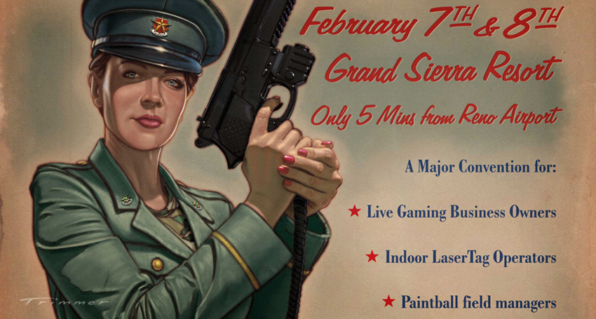
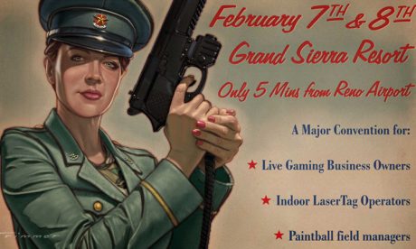
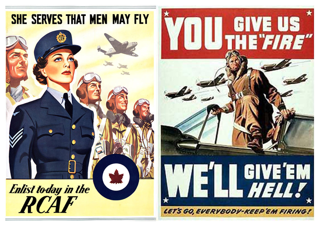
In a departure from an existing pre-determined modern design style that reflects its militaristic ethos, Nicole Lander Marketing CO of Battlefield Sports in Brisbane wanted to emulate the look of 1940’s war time recruitment and propaganda posters for the convention program cover, featuring the new-to-the-market “M9 Sabre” laser pistol modelled by the existing face of Battlefield Sports, “C.O Siren”.
Grafix Garage had already completed an extensive range of comprehensive web design and logo work for the company, so for me it was a welcome opportunity to contribute some fun custom illustration action to an interesting collaboration.
REFERENCE
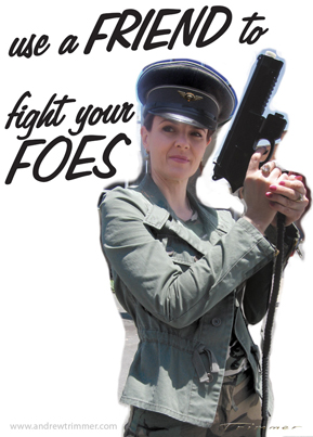
The process began by net sourcing a few reference photos of period correct World War 2 Armed Forces recruitment posters, then styling a few layouts based on these images with titles and text relevant to the program cover. The main illustration needed to be composed within an A4 vertical format alongside the text areas.
PROCEDURE
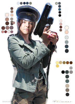
Once a basic layout was determined, we held a brief photography session in the mid-day sun with stand-in model Kate dressed in military clothes posing with the M-9 Sabre laser pistol supplied by the client. Later in photo comping the original model’s “Siren’s” matching face would be replaced over the top. The mismatch in the lighting on her face from our model shoot would be corrected during illustration.
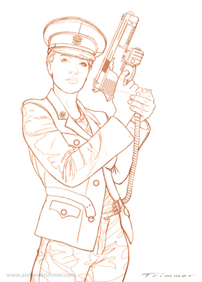
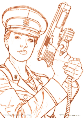
IMAGE TRACE
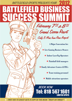
Once the base photo comp was approved the illustration process began. From here, the image was traced on screen in Photoshop CS6 via a 21 inch Wacom Cintiq UX Interactive monitor to create the sepia-toned line art, which would become the base over which all the colouring layers would be applied.
Two font variations for the main title on the cover was proposed, “Use a Friend to Fight your Foes”, referencing the newly released laser pistol, but was subsequently rejected to adhere to the direct marketing requirements of the convention event rather than a single product focus.

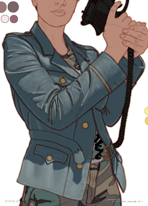
PAINTING
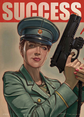
The colour palette was picked from the photo reference, and then flat areas of each base colour were laid in as an underlay. This “cartoon” base provides the mid tones that subsequent lighter areas are painted over.
Lighter hues from the palette were built up with a soft bristle brush to begin separating the contrasts.
Colour adjustments were made to the jacket tone to bring it closer to a faded army green rather than an air force blue.
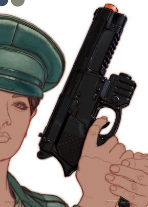
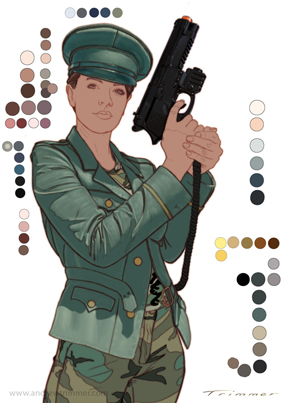
Individual sections were concentrated on and coloured one after the other; the main torso jacket, pants cammo and belt, the pistol, the hands, and lastly the face. Once all the lighter areas were finished, shadow tones were added to enhance depth and balance.
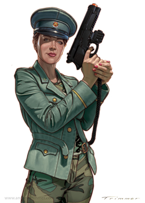
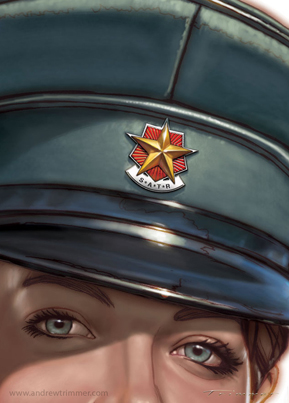
For final balance all the highlight hues and side rim lighting are added to help make it pop.
The badge on the hat and lapel button logos were originally designed and supplied by Craig as small web icon buttons for the company’s Battlefield Live web site, and a little morphing tweak adjustment pushed their perspective to fit the angle.
LAYOUT & COMPOSITING
While I was completing the illustration, Craig laid out the colour header banners and placed different sets of headings in period correct fonts from text supplied by the client in Corel Draw X over a line version of the artwork to arrive at a final composed layout. The top and bottom header banners and body text were then exported as EPS (encapsulated post script) elements.
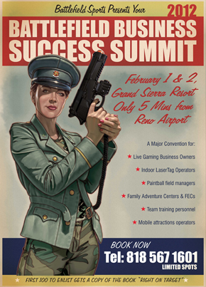
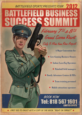
These elements were imported back into a final 300 dpi CMYK A4 Photoshop comping layout that included a background texture layer of aged distressed paper, over which an isolated etched version of the final illustration art was placed, along with all the EPS text layers.
FINAL ADJUSTMENTS
Further refinements to the image include subtle age staining of the background paper, a floating water colour tint area behind her head and pistol, and some slight distressing creases to the main colour header banners. Also to add a touch of “printing authenticity”, some of the text headings were deliberately miss-aligned with the colour tint area, giving it a subtle off-set print quality.
The final touch was to set the etched illustrated girl and text areas to a multiply blending mode that allowed the texture of the paper to show through creating the impression the illustration was printed “into” the paper, rather than it appearing to float too brightly compared to the clean finish of the digital art.
The final comp of the illustration over the text layout elements designed by Craig Litchfield at Grafix Garage. This theme was followed throughout the program booklet styled to mimic a relic WW2 Army Issue instruction manual with faded black and white photos, and time-stained paper with ragged edges.
This was a great example of creative synergy between a client that wanted something unique, and a graphic designer and illustrator who work cleverly together to achieve a balanced and appealing composition with all the bespoke elements created.
The client was thrilled with the final result and the interior design layout of the program added immensely to the authentic aged look of a period recruitment manual. Many participants took close interest in the look of the program, and took them away as a memorable keep-sake of their weekend away power junket.
